Open the LADCO Air Toxics Map App
App Description
These two applications visualize air toxics monitoring data across different locations in the Great Lakes region over time (2010 to 2023). They allow you to explore both geographical patterns and temporal trends of various annual average air toxics concentrations measured by air quality monitoring stations.
These two apps were developed by Alec Sheets (Ohio EPA) and Angie Dickens (LADCO) for the 2025 5-Year Air Monitoring Network Assessment for the Region 5 States.
Data Preparation
The apps plot the annual average concentrations of individual air toxics. These annual averages were calculated by:
- Downloading the raw toxics data from EPA’s Air Quality System (AQS),
- Replacing any values below the method detection limit (MDL) with one half of the MDL[1],
- Removing null data and data from industrial monitors,
- Calculating daily means for each POC at a site,
- Calculating daily means averaging together the daily means at all POCs at a site,
- Calculating monthly means by averaging the daily means for each site,
- Calculating annual means by averaging the monthly means, with the requirement that the site must have at least three months of data in that year.
[1] This is a common way of treating data points below the MDL, as referenced here.
LADCO Air Toxics Trends App
The app has a sidebar for selecting data and a main panel showing visualizations:
- Data Selection (Left sidebar, Figure 1):
- Start by selecting a CBSA (Core Based Statistical Area).
- Choose one or more parameters (pollutants) to view.
- Select specific monitoring stations or all stations in the area.
- Set your desired date range using the calendar inputs (optional; the default is 2010 to 2023).
- Visualizations (Main window, Figure 1):
- The trends plots show how annual average concentrations (y) changed over time (x).
- Each line represents an individual site (the average of all POCs at that site, see data preparation above). Each site has a unique color and line type combination.
- A separate panel plot is shown for each pollutant, with the units for that pollutant listed below the name of the pollutant at the top of the plot.
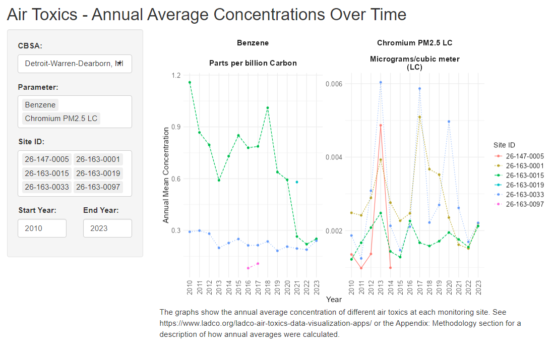
Figure 1. Screenshot of the LADCO Air Toxics Trends App, with example pollutants shown for Detroit.
LADCO Air Toxics Map App
- Data Selection (Left sidebar, Figure 2):
- Start by selecting a parameter to map.
- Use the slider to select a year to map
- Visualizations (Main window, Figure 2):
- The colors of the points in the map show how annual average concentrations vary by site across the region, where each point represents a monitoring site.
- The map is interactive, so you can zoom in on particular areas of interest or zoom out to look at the region as a whole.
- Click on a point to see the site ID, parameter name, the annual mean concentration for that year, the units, and the site operator in a pop-up window.
- Note that values in the color bar are reversed from the usual order, with the highest concentrations at the bottom (yellow) and the lowest concentrations at the top (purple). Note also that the order of these colors is different that that of the AQI scale, in which purple corresponds to highest concentrations and yellow to lower concentrations.
- The box below the slider lists the statistics (minimum, median, and maximum) for annual average concentrations across all monitors for the selected year (top) and for all years (bottom).
- The units are listed in the legend, along with the parameter being plotted.
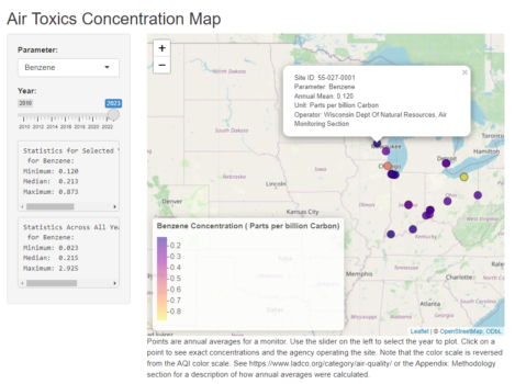
Figure 2. Screenshot of the LADCO Air Toxics Map app, with benzene shown as an example. Note the pop-up shown for one site as an example.
]]>App Description
The LADCO Urban Increment R-Shiny App displays the urban, rural, and urban increment PM2.5 concentrations for central counties in Core-Based Statistical Areas (CBSAs) across the lower 48 states. Users can select one or more states, one or more CBSAs in the selected states, and then one or more counties in the selected CBSAs to display stacked bar charts and tabulated urban increment data. Descriptions of the data and methods used to develop this tool follow.
This version of the app has been updated from the original app in several ways. (1) Urban areas are now defined based on CBSAs rather than land use classified as urban. This is computationally much faster. In the Great Lakes region, there is excellent overlap between the two definitions of urban areas. (2) Rural PM2.5 is averaged within a 150-mile radius of the CBSA rather than by state. These averages are more representative of the rural background around the urban area, and this approach more closely parallels EPA’s monitor-based approach (described below). (3) Urban increments are given for each county in an urban area rather than for the urban area as a whole. This provides more details about variation in the urban increment within urban areas. (4) Users can choose to display the urban increment based on the mean, 90th percentile, or maximum grid cell in the county.
Background
With the promulgation of a revised annual PM2.5 standard in February 2024 there is a demand for new air quality analysis products to understand the current profile of particulate pollution in the U.S. One of the data analysis products that contributes to the nonattainment area designations process is an urban increment analysis (see section 1.4 of US EPA, 2024). Per this memo, “the goal of the urban increment analysis is to estimate the local contribution to urban PM2.5 as measured at violating regulatory monitor sites and thereby provide additional evidence to consider in deciding which nearby areas with sources contributing to the monitored violations in the area to include within the boundary of the designated nonattainment area.”
The conventional approach for an urban increment analysis is to use surface monitors sited in urban and rural areas to estimate an urban increment at potential violating monitors. The urban monitors are part of the Chemical Speciation Network (CSN), and the rural PM2.5 concentrations are estimated using data from the IMPROVE program. The urban increment is simply the difference between a period-averaged concentration at the urban monitor and an analogous concentration at rural monitors that are within 150 miles of the urban site. Given the sparsity of the IMPROVE network, particularly in the Great Lakes region, there is an opportunity to explore alternative urban increment analyses that are based on PM2.5 data with more continuous spatial coverage.
Satellite PM2.5 Data
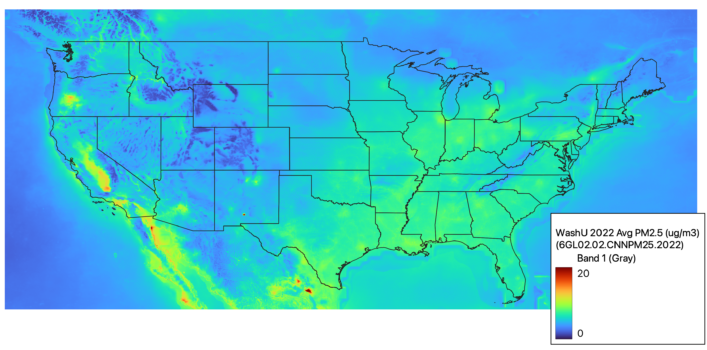
The Atmospheric Composition and Analysis Group at Washington University have developed satellite-derived global and regional PM2.5 data (Figure 1). These data are a fusion of satellite, modeled, and surface data. The fused data are estimated for “annual and monthly ground-level fine particulate matter (PM2.5) by combining Aerosol Optical Depth (AOD) retrievals from the NASA MODIS, MISR, SeaWIFS, and VIIRS with the GEOS-Chem chemical transport model, and subsequently calibrating to global ground-based observations using a residual Convolutional Neural Network (CNN).” The V6.GL.02.02 data are available for 1998-2022 on a 0.01 degree grid. Given the spatial continuity of these data and their relatively high correlation with surface observations, they provide a viable alternative to surface monitors for use in an urban increment analysis.
Methods
We used a GIS (ArcGIS Pro 3.3.2) to conduct all of the calculations and data processing steps for this analysis. The basic approach was to convert the netCDF gridded PM2.5 data to a raster, separate the raster into rural and urban PM2.5 rasters, and then use zonal statistics to get the concentrations in the rural and urban areas. Urban areas were defined as central counties within a metropolitan CBSA, and rural areas were defined as areas in the U.S. within 150 miles of a CBSA and outside an urban area. With the urban and rural concentrations, we could then calculate the urban increment in each urban county. Note that urban concentrations were calculated as either county means, 90th percentile values, or maxima. 90th percentile values are most likely to track concentrations at the controlling monitors. Additionally, the use of CBSAs to define urban areas should work well for most of the U.S. but will include vast rural areas in parts of the western U.S. where counties and their related CBSAs are very large. The detailed steps and data that we used are described below.
This app was developed by Zac Adelman and Angie Dickens at LADCO.
Data
- PM2.5 data: 2022 global 0.01 degree PM2.5 data in netCDF format (Washington University V6.GL.02.02)
- CBSA definitions: Census Core-Based Statistical Area (CBSA) to Federal Information Processing Series (FIPS) County Crosswalk (National Bureau of Economic Research, July 2023)
- U.S. Counties Map: USA Census Counties layer from the ESRI Living Atlas (dtl_cnty, accessed October 2024)
Processing Steps
- Use R to convert netCDF PM2.5 data to a raster and window in on the contiguous U.S. (download R code).
- Load the PM2.5 raster (Figure 1) and the CBSA County Crosswalk into ArcGIS Pro.
- Join the CBSA County Crosswalk table to the USA Counties map.
- Develop an urban areas (CBSAs) layer by selecting and deleting counties in the attribute table for the joined CBSA-Counties layer that: (a) are not in a CBSA, (b) are in a micropolitan CBSA, or (c) are in outlying counties of a CBSA. This will leave just central counties in a metropolitan CBSA (Figure 2).
- Develop a rural PM2.5 layer for areas in the counties layer but not in the urban areas layer (Figure 2).
- -Prepare to combine the layers:
- -Adjust the extents to match: Use Clip Raster to clip the counties and urban area (CBSA) rasters to the extent of the PM2.5 raster.
- -Handle missing data explicitly using Raster Calculator to specify that NoData points should be 0s.
- –Resample each raster to the PM2.5 raster to adjust grids so that they match exactly.
- -Combine the counties and urban area (CBSA) layers with the PM2.5 layer using Raster Calculator and the conditions that the adjusted urban areas layer = 0 (i.e., is not urban) and the adjusted counties layer = 1 (i.e., is in a U.S. county).
- -Prepare to combine the layers:
- Calculate the (a) mean, (b) 90th percentile, and (c) maximum PM2.5 within urban CBSA counties (Figure 3). This will calculate the concentration for each county. Use Zonal Statistics as Table to combine the PM2.5 layer with the urban areas (CBSA) layer and calculate the mean using statistics type = (a) Mean, (b) Percentile, with percentile set to 90, or (c) Maximum.
- Calculate the mean PM2.5 within rural areas within 150 miles of a CBSA (Figure 5).
- -Merge all counties in a CBSA into one polygon using Dissolve.
- -Apply a 150 mile buffer to this CBSA layer using the Buffer tool. You will have buffers for each CBSA (Figure 4).
- -Use Zonal Statistics as Table to combine the PM2.5 layer with the buffer layer and calculate the mean using statistics type = Mean. This step calculates the average PM2.5 in rural areas around each CBSA (Figure 5).
- Combine the urban and rural PM2.5 layers by joining the two attribute tables by CBSA. This will give you a layer with entries for each county, with the CBSA mean rural concentration and the county mean, 90th percentile, and maximum urban concentration.
- Calculate the urban increment by creating a new field in the attribute table of the new combined layer and using Calculate Field to subtract the rural mean PM2.5 from the urban mean/90th percentile/maximum PM2.5 (Figures 6-8). Figure 9 shows the 90th percentile urban increments zoomed in on and scaled to the Great Lakes region.
- Also calculate the mean/90th percentile/maximum PM2.5 for each CBSA as a whole using Zonal Statistics as Table.
Results
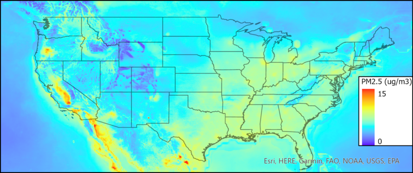
Figure 1. Washington University 0.01 degree 2022 average PM2.5.
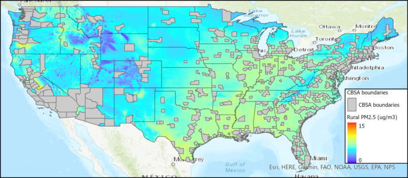
Figure 2. Metropolitan Core Based Statistical Areas (CBSAs, central counties only) and PM2.5 concentrations in rural areas in the U.S.
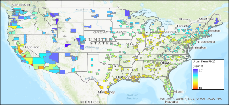
Figure 3. Mean PM2.5 for urban counties (central counties in metropolitan CBSAs).
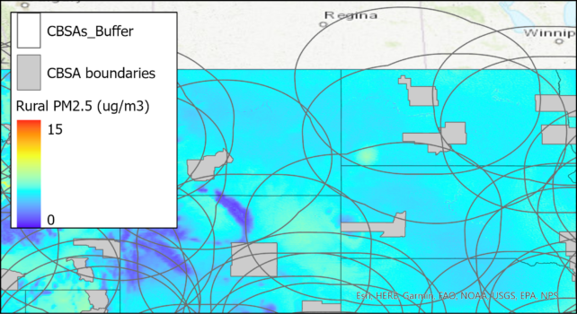
Figure 4. Metropolitan CBSA and rural PM2.5 with 150-mile buffers around CBSAs, zoomed in on the northern Great Plains region. The colored areas within each buffer were subsequently averaged to give the mean concentrations shown in Figure 5.
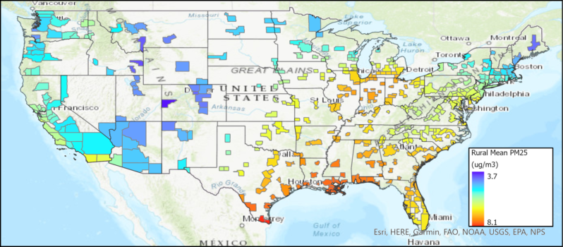
Figure 5. Mean PM2.5 for rural areas in the U.S. within 150 miles of each CBSA. Concentrations are given for each CBSA as a whole.
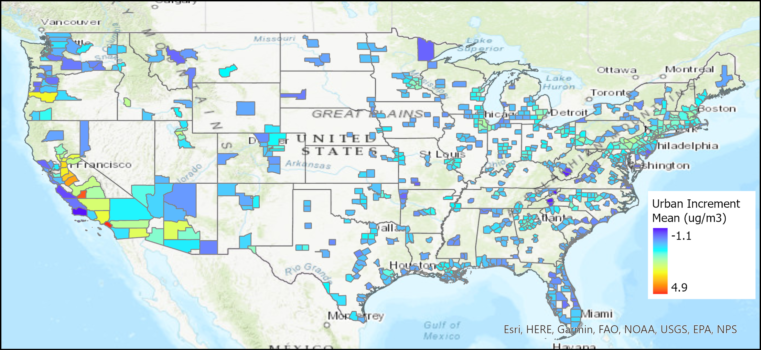
Figure 6. Urban increment based on the mean concentration for urban counties, determined as the difference between the mean urban and mean rural PM2.5 concentrations.
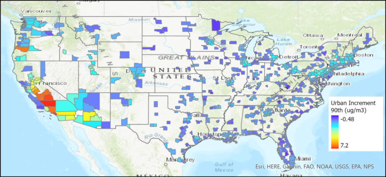
Figure 7. Urban increment based on the 90th percentile concentration for urban counties, determined as the difference between the 90th percentile urban and mean rural PM2.5 concentrations.
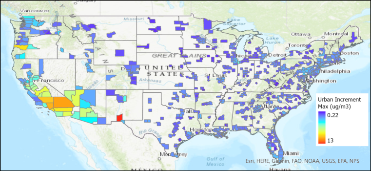
Figure 8. Urban increment based on the maximum concentration for urban counties, determined as the difference between the maximum urban and mean rural PM2.5 concentrations.
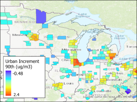
Figure 9. Urban increment based on the 90th percentile concentration for urban counties in the Great Lakes region.
]]>App Description
The LADCO Urban Increment R-Shiny App displays the urban, rural, and urban increment PM2.5 concentrations for urban areas across the lower 48 states. Users can select one or more states, and then one or more urban areas in the selected states to display a stacked bar chart and tabulated urban increment data. Descriptions of the data and methods used to develop this tool follow.
Background
With the promulgation of a revised annual PM2.5 standard in February 2024 there is a demand for new air quality analysis products to understand the current profile of particulate pollution in the U.S. One of the data analysis products that contributes to the nonattainment area designations process is an urban increment analysis (see section 1.4 of US EPA, 2024). Per this memo, “the goal of the urban increment analysis is to estimate the local contribution to urban PM2.5 as measured at violating regulatory monitor sites and thereby provide additional evidence to consider in deciding which nearby areas with sources contributing to the monitored violations in the area to include within the boundary of the designated nonattainment area.”
The conventional approach for an urban increment analysis is to use surface monitors cited in urban and rural areas to estimate an urban increment at potential violating monitors. The urban monitors are part of the Chemical Speciation Network (CSN), and the rural PM2.5 concentrations are estimated using data from the IMPROVE program. The urban increment is simply the difference between a period-averaged concentration at the urban monitor and an analogous concentration at rural monitors that are within 150 miles of the urban site. Given the sparsity of the IMPROVE network, particularly in the Great Lakes region, there is an opportunity to explore alternative urban increment analyses that are based on PM2.5 data with more continuous spatial coverage.
Satellite PM2.5 Data
The Atmospheric Composition and Analysis Group at Washington University have developed satellite-derived global and regional PM2.5 data. These data are a fusion of satellite, modeled, and surface data. The fused data are estimated for “annual and monthly ground-level fine particulate matter (PM2.5) by combining Aerosol Optical Depth (AOD) retrievals from the NASA MODIS, MISR, SeaWIFS, and VIIRS with the GEOS-Chem chemical transport model, and subsequently calibrating to global ground-based observations using a residual Convolutional Neural Network (CNN).” The V6.GL.02.02 data are available for 1998-2022 on a 0.01 degree grid. Given the spatial continuity of these data and their relatively high correlation with surface observations, they provide a viable alternative to surface monitors for use in an urban increment analysis.
Methods
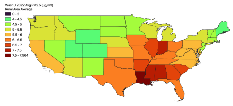
I used a GIS (QGIS 3.24.0) to conduct all of the calculations and data processing steps for this analysis. The basic approach was to convert the netCDF gridded PM2.5 data to a raster, clip the PM2.5 data by urban and rural landuse, and then use zonal statistics to get the average concentrations in the rural and urban areas of each state. With the urban and rural concentrations I could then calculate the urban increment in each urban area. Here are the detailed steps and data that I used.
Data
- PM2.5 data: 2022 global 0.01 degree PM2.5 data in netCDF format (Washington University V6.GL.02.02)
- State boundaries: 2016 state boundary shapefile (US Census @ 1:500,000)
- Urban areas: 2023 urban area shapefile (US Census Tiger Line)
Processing Steps
- Use R to convert netCDF PM2.5 data to a raster and window in on the U.S. (download R code).
- Load the PM2.5 raster and the two shapefiles above into QGIS.
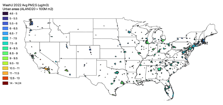
- Filter the urban area shapefile to include only medium and larger cities. I used the land area (ALAND20) attribute to Extract by expression only urban polygons with land areas greater than 100 million m2.
- Clip the Air Pollution Raster by the Urban Land Use
- Vectorize the Urban Areas:
- Use the Rasterize (vector to raster) tool to create a binary raster that represents urban areas. The resulting raster will have values of 1 for urban areas and “no data” for non-urban areas. Use the filtered urban shapefile from step 3 above.
- Vectorize the Urban Areas:
- Mask the air pollution data to the non-urban (rural areas):
- Use the Fill NoData cells tool to replace the “no data” values in the binary urban raster from above with “0”.
- Use Raster Calculator to invert the urban raster to create a non-urban raster by subtracting the updated binary urban raster from 1, e.g., “1 – urban”. The resulting raster file will have “1” for the non-urban areas on “0” for the urban areas.
- Use Raster Calculator to multiply the air pollution raster by the binary non-urban raster. This will mask the air pollution data to only non-urban areas. This is the intermediate dataset that will be used to calculate the rural PM2.5 concentrations in each state.
- Calculate the urban and rural concentrations in each state:
- Zonal Statistics by Urban Area:
- Open the Zonal Statistics tool (
Raster→Zonal Statistics). Choose the filtered urban area boundary shapefile as the vector layer. - Select the rasterized netCDF air pollution file (created in step 1) as the raster layer.
- Set the statistic type to calculate (mean, sum, etc.). For average concentration, select the mean.
- Run the tool, which will add a new attribute to your urban shapefile containing the mean PM2.5 air pollution concentration for each urban area
- Open the Zonal Statistics tool (
- Zonal Statistics by Rural Area:
- Open the Zonal Statistics tool (
Raster→Zonal Statistics). Choose the state boundary shapefile as the vector layer. - Select the non-urban PM2.5 raster (created in step 5) as the raster layer.
- Set the statistic type to calculate (mean, sum, etc.). For average concentration, select the mean.
- Run the tool, which will add a new attribute to your state shapefile containing the mean rural PM2.5 concentration for each state
- Open the Zonal Statistics tool (
- Zonal Statistics by Urban Area:
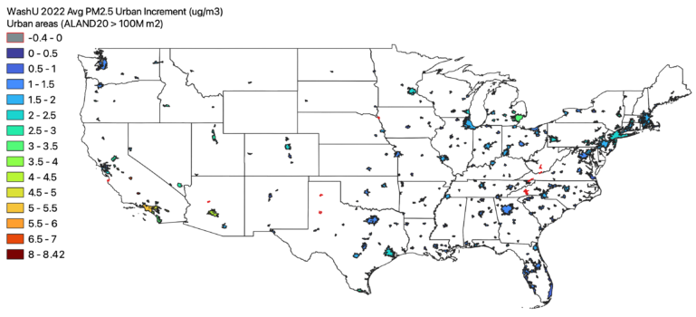
- Combine all of the data into a single shapefile and calculate the urban increment
- Add state attributes to the urban area shapefile
- Because the urban area feature from the Census doesn’t have a state ID, add it in using the Join attributes by location tool. You can directly join the augmented state shapefile with rural concentrations from the previous step since it has all of the information we’ll need here.
- Start with the urban shapefile that includes the mean PM2.5 concentrations created in step 6, and Join attributes by location selecting the state shapefile with rural concentrations as the layer to join with. For the geometric predicate select “intersect” and for the Join type “take attributes from the feature with the largest overlap”. This last step ensures that for multi-state urban areas we will associate with the rural concentration from the state that most intersects with the urban polygon.
- Calculate the urban increment
- Use the field calculator to take the difference of the urban mean concentration and the state rural mean concentration to get the urban increment for each urban area
- Output the new Shapefile with the state and urban metadata, the urban PM2.5 concentrations, rural PM2.5 concentrations, and urban PM2.5 increment.
- Add state attributes to the urban area shapefile
Results
Wednesday July 24, 2024 @ 11:00 – noon Central (Teams Link)
Victor Geiser, LADCO Summer-2024 Intern

Abstract: In this study, we used Self Organizing Maps (SOMs) for analyzing the meteorological conditions during June days from 2019 through 2023 and associated PM2.5 concentrations in the Midwest. Through an understanding of synoptic scale meteorological patterns and an introspective look at the vertical structure of the atmosphere, we gauge common and less common weather patterns for various levels of PM2.5 concentrations including those influenced significantly by wildfire smoke transported into the LADCO region.
The figure below shows the daily fine particle pollution (PM2.5) concentrations average across all monitors in the Great Lakes region for the year 2019-2023. Each colored line represents the daily average for each year. The particle concentrations in 2023 are shown by the blue line, with several high pollution events between June and September. The late June 2023 event was historic and led some media outlets to declare that cities in the region had the “worst air pollution in the world” during that period.

LADCO supports air quality planners in the region
LADCO works with our member states to track and understand the impacts of fire smoke on air quality in the region. Wildfire smoke poses a challenge for state and local air quality planning agencies in the Great Lakes region because it falls outside of their regulatory jurisdictions. There is nothing a state planning agency can do about controlling pollution from fire smoke, particularly if the fires are located far away, like Canada or the western U.S.
LADCO uses data science and computer modeling to quantify the amount of pollution entering the region from wildfires, and to identify the days during which smoke-influenced pollution is the worst. We work with our member states and U.S. EPA to account for pollution periods caused by transported wildfire smoke.
LADCO in the news discussing fire smoke and air quality
LADCO’s Executive Director has been in the news quite a bit since summer 2023 talking about wildfire smoke and air quality in Chicago.
The health of effects of Chicago’s Air Pollution (NPR, July 11, 2023)
View the R Shiny App
Usage Notes
It takes the data a couple of minutes to render on the map, so please be patient. After the data are loaded you can zoom and pan the map, toggle the data sources on/off via check boxes, and if you click on any of the green point source locations or blue warehouse locations you’ll get data about the nature and size of the feature. The point and warehouse icons are scaled based on the size of the source: NOx emissions (tons/year) for the point sources and the number of loading docks for the warehouses.
Data Sources:
2019 NO2 Concentrations: Estimated annual average surface-level NO2 concentrations in 2019 derived from a global 1 km x 1 km land-use regression model detailed in Anenberg, Mohegh et al. (2022) and averaged to underlying census tracts following the methods described in Kerr et al. (2021)
2022 Point Source NOx Emissions: U.S. EPA 2022v1 emissions modeling platform. The data were extracted from the 2022v1 emissions review tool that is accessible from the platform webpage.
Warehouse Locations: Locations of warehouses that are larger than 20,000 sq ft. from CoStar.
]]>The LADCO Executive Director describes the motivation and approach for using the Amazon Web Service cloud in a March 2021 AWS Public Services Sector blog post (Modeling Clouds in the Cloud for Air Pollution Planning: 3 Tips from LADCO on Using HPC).
LADCO’s work on air quality modeling in the cloud was also presented at the 2021 CMAS Conference. See our Executive Director’s presentation below. Reach out to our director, Zac Adelman, if you’re interesting in learning more about how we’re using AWS to support our air pollution applications and research activities here at LADCO.
]]>Donna’s presentation (Mercury in the Environment: Health Impacts, Sources, Sampling, and Trends) gives an overview of the state-of-the-science on the fate and transport of mercury in the atmosphere. The presentation describes why we’re concerned about mercury from a human health standpoint, how mercury behaves in the environment, and how mercury concentrations have changed over time in different environmental media. Details on the mercury monitoring network in the region describe a technically robust set of instruments with a minimal level of spatial coverage for monitoring the trends in mercury concentrations from U.S. and global emissions sources.
Mercury monitoring is inexpensive ($18,000 for new equipment and $9,500/year to operate) and given the scarcity of sites in the network, new monitors add significant value to the database of information on the environmental impacts of atmospheric mercury in the region.
Additional information about how LADCO works to understand environmental mercury in our region is on the LADCO website.
]]>The NCA4 report includes chapters by issue and region. The chapters on Air Quality and the Midwest describe the current state-of-the-science on how climate change is impacting, and will impact, air pollution in the LADCO region. Described as the “climate penalty”, current evidence suggests that climate change is leading to a net increase in air pollution in our region. For instance, summertime ozone concentration and ozone-related premature deaths are projected to increase in the 2050s and 2090s (see NCA4 Fig. 13.2 and Fig. 21.9) in the Midwest.
Climate conditions in the LADCO region that are favorable to air pollution are projected to increase in the future. In fact, the significant reductions in air pollution emissions realized in recent years may be attenuated by rising temperatures, increasing energy demands, and increasing wildfires. From the public health and economic standpoints, NCA4 notes that the ozone pollution impacts alone could result in 200-550 premature deaths annually in the Midwest by 2050 with regional costs as high as $4.7 billion.
The NCA4 report is not all doom and gloom. It offers solutions and mitigation strategies, some of which are already in place in the LADCO region. State Departments of Health throughout the LADCO region have been building climate resiliency plans that identify risks to minimize the health impacts to vulnerable communities. As climate altering pollution and air pollution emissions often share the same sources, there are opportunities to gain co-benefits by reducing the emissions from industrial and traffic sources. In other words, strategies to reduce air pollution emissions from cars, such as cleaner engine technologies, will also reduce carbon dioxide and help to mitigate climate change. It is also true that some strategies to reduce greenhouse gas emissions will reduce air pollution.
A key message in the NCA4 report is the connection between climate change and air pollution in the LADCO region. As temperature is a primary driver of ozone pollution in our region, forecasts of higher temperatures in the region present an air pollution planning challenge. Our predictions of the effectiveness of emissions reduction strategies, which are fundamental to State Implementation Plans, will likely become less reliable if we don’t also consider climate forecasts in our planning models.
]]>
Smoke from large wildfires can spread wide and far. In 2018 we observed smoke on several days in the LADCO region that originated from fires in the western U.S. and Canada. Wildfire smoke is a concern because it contains harmful air pollutants, including particles, air toxics, and ozone precursors [1,2]. The health impacts from fire smoke exposure include increased rates of respiratory diseases, such as asthma and chronic obstructive pulmonary disease.
The image above shows wildfire smoke viewed from space on August 4, 2018. Darker shades of grey indicate thicker layers of smoke. The circles overlaid on this plot are daily maximum ozone concentrations at monitoring sites. Orange and red colors represent locations with unhealthy air quality concentrations. This image of smoke impacts is fairly typical of the summer of 2018, in which large fire complexes in the Western U.S. produced smoke that blanketed the atmosphere over the majority of the country.
Smoke that is transported into the LADCO region degrades our air quality. Ozone, fine particulate matter, and regional haze may all be influenced by smoke that originates from thousands of miles away. LADCO is working with our member states to understand the trends in smoke impacts on our region and what the implication of these impacts are on public health and regulatory compliance. We are integrating surface monitoring, remote sensing, and modeling into a data platform to identify in near real-time the extent to which fire smoke is exacerbating air pollution in our region.
]]>